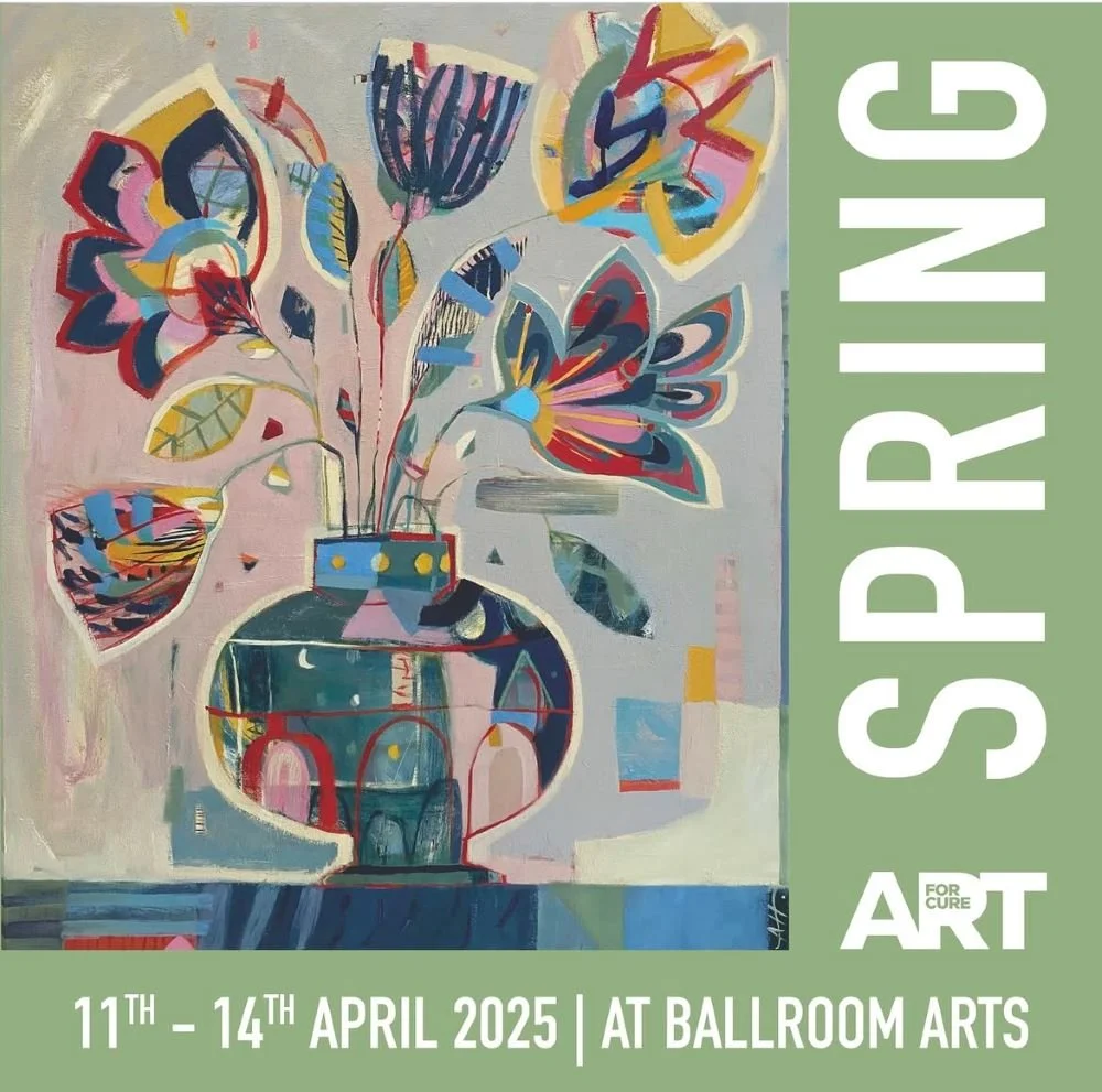
Art For Cure – Spring Exhibition
I had such a good time making this series of paintings. I bought 12 cradled wooden panels – 25 x 25cm and worked with a limited palette. For the first 4 I used cadmium red, white and paynes grey – wasn’t very keen. For the next 4 I used yellow ochre, white and paynes grey – better. For the next 4 I used all of them together and found the sweet spot.
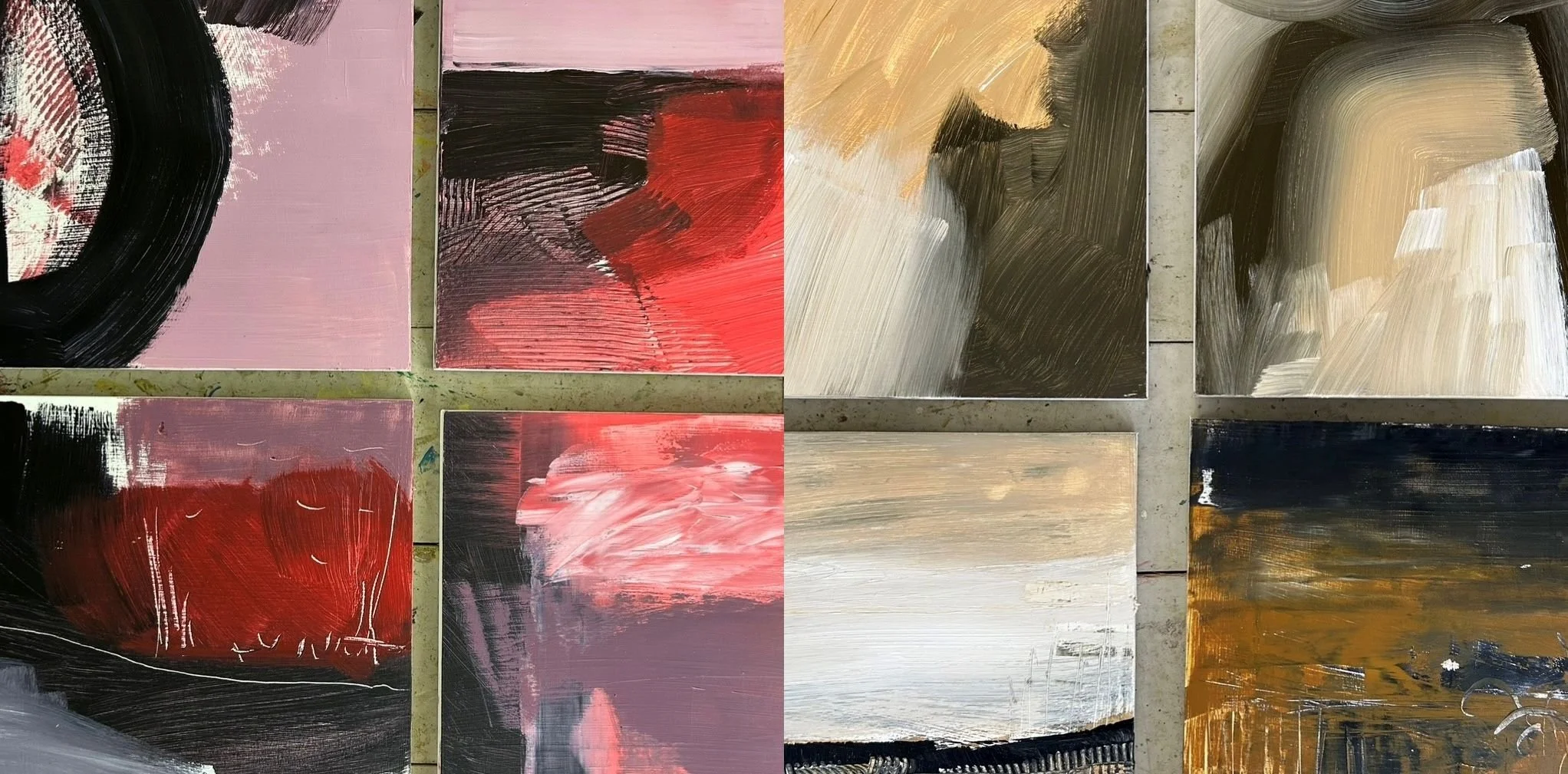
I built on this first layer with thick paint, watery glazes, brighter, darker colours, hard lines, soft edges – trying all the things, not thinking too much and responding to what was happening.
The paintings came together really well. A series of abstract landscapes that related to one another but each with their own identity.
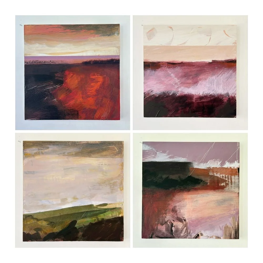
This colour palette had produced such an array of beautiful colours that I wanted to bring these on to the edges of the paintings. The colours were particular to each painting and were to chosen to highlight or contrast or surprise. This meant that when they were framed I wanted these edges to be seen, so there is space around each painting in its frame.
The 12 paintings were sent down to Ballroom Arts for the exhibition in April and displayed as a grid of 9 with all 12 on the website. I was delighted to be able to get to Aldeburgh for the private view, it was lovely to meet Belinda the founder of the Art For Cure charity, all the volunteers working at the exhibition and the other amazing artists and get to chat to the visitors.
At the end of the exhibition I could not have been happier to have sold 10 out of the 12 paintings.
